A short detour from the discussion on Gradient Descent and addressing its issues.
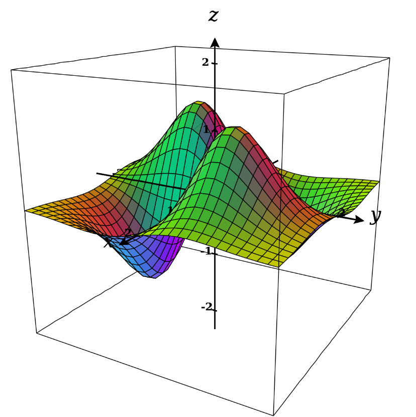
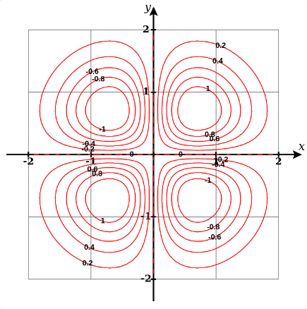
3D (and higher dimensions) plots can be rather hard to visualise and plot. Contour maps provide a way to visualise them in 2D. If we have a function , a contour map would show how the function’s graph would look like if we sliced into several pieces such that each piece represent a particular value of . Within the area of each part, the function will be equal for all values of and . Take the following example, where we have a 3D plot (first picture) followed by its contour map (second picture):


The labels on the circles represent the various values of . Notice that the difference in is equal throughout the plot, which means that slices are drawn uniformly. In areas where the distance between these rings is large, when we move from one ring to another, we take a large step for a change of to . When the distance between the the rings is small and we move from one to another, we take a small step but the jump in is the same.
This shows us that where the rings are clustered together, the slope of the curve is large and where they spread out, the slope of the curve is small.
There’s a useful video on Khan Academy that explains contour maps and their application.